

Key Takeaways
Neutrals and Accent Colors
Neutrals are colors with low saturation — think white, black, gray, beige, navy, and camel — that pair easily with almost anything. Accent colors are more saturated or visually distinct hues that draw the eye and add personality. Together, they form the building blocks of a cohesive outfit.
In color theory, neutrals are often described as achromatic (true black, white, gray) or near-neutral (warm beiges, taupes, navies). Their low chroma means they don't compete with other hues, making them natural anchors in any outfit.
Why Three Colors Works
Getting dressed shouldn't require a degree in art theory. Yet most people have stood in front of a full closet feeling like nothing goes together. The problem usually isn't a lack of clothes — it's a lack of a simple organizing principle.
The three-color framework is that principle. It works because the human eye processes contrast and repetition naturally. When an outfit has too many competing colors, the brain works harder to make sense of it, and the result can feel busy or unresolved. When an outfit has too few — say, a single flat color head to toe — it can feel one-dimensional. Three colors hit a balance: enough variety to be interesting, enough cohesion to feel intentional.
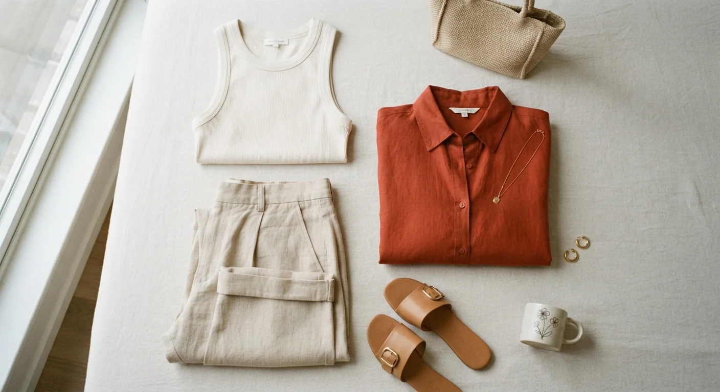
The formula is straightforward: one dominant color (usually a neutral that covers the most surface area), one secondary color (another neutral or a muted tone), and one accent (a more distinct hue used in smaller amounts). This 60-30-10 proportion — dominant, secondary, accent — is a concept borrowed from interior design that translates seamlessly to clothing.
60–30–10
Classic proportion for dominant, secondary, and accent colors
This ratio — widely referenced in design and styling contexts — helps distribute color in a way the eye naturally reads as balanced.
3
Colors most stylists recommend as a practical maximum per outfit
Limiting an outfit to three distinct colors is a longstanding guideline in personal styling education, helping prevent visual clutter.
If you're just building your style instincts, this framework pairs well with the foundation covered in everyday dressing basics — it gives your wardrobe a logical structure to build from.
The Role Neutrals Play
Neutrals do the heavy lifting in almost every well-dressed outfit. They provide a calm visual backdrop that lets everything else — including your face — stand out. Black trousers, a beige coat, a white shirt, a gray sweater: these are pieces that don't demand attention for themselves but make the whole look function.
Because neutrals have low saturation, they don't clash with each other. Navy and camel together? That works. Cream and charcoal? Works. White, gray, and black in one outfit? Still cohesive. This means your dominant and secondary color slots can almost always be filled with neutrals safely, leaving the third slot open for something with more personality.
Build Your Neutral Base First
When building or editing your wardrobe, prioritize neutrals for your highest-cost, highest-wear pieces — coats, trousers, denim, and shoes. This gives you maximum flexibility when introducing accent colors through lower-cost accessories or seasonal additions. Reversing this — investing in statement pieces first — limits how often those pieces can realistically be worn.
Building a wardrobe anchored in versatile neutrals also reduces decision fatigue. When most of what you own works together, getting dressed becomes faster. This is one reason wardrobe minimalism — explored in depth in our guide to buying fewer clothes and getting more out of them — tends to rely heavily on neutral foundations.
One nuance worth noting: not all neutrals sit in the same temperature range. Warm neutrals (camel, cream, warm gray) and cool neutrals (charcoal, true white, icy gray) don't always mix smoothly. Staying within one temperature — all warm or all cool — creates a more polished result, though breaking this rule intentionally can also work.
How Accent Colors Create Intention
An accent color is what keeps a neutral outfit from feeling forgettable. It's the rust-colored bag against a gray and white outfit, the cobalt scarf over a beige coat, or the emerald earrings with a cream blouse and black jeans. The accent doesn't need to shout — it just needs to be distinct enough from the neutrals to register.
Importantly, accents work because they're used in small doses. If that rust color appeared in your shoes, your bag, your belt, and your top, it would no longer function as an accent — it would become a dominant. The accent's visual impact comes precisely from restraint.
Choosing an accent color doesn't require formal color theory knowledge, though understanding complementary relationships (colors opposite each other on the color wheel, like blue and orange) can help explain why certain combinations feel satisfying. Analogous accents — colors adjacent to your neutrals on the wheel — tend to feel harmonious and subtle. Complementary accents feel bolder and more energetic.
For guidance on introducing pattern alongside color, pattern mixing principles are worth understanding — the same logic of visual balance applies.
Applying the Framework in Practice
The three-color rule only becomes useful when it's applied practically — not as a rigid constraint but as a mental checkpoint. Before you leave the house, do a quick count: how many distinct colors are in this outfit, including shoes, bag, and jewelry? If the answer is four or five, consider where you can simplify.
A few practical applications:
- Office outfit: Charcoal trousers (dominant), white shirt (secondary), burgundy loafers (accent).
- Weekend casual: Mid-wash jeans (dominant), cream sweatshirt (secondary), olive green tote (accent).
- Evening look: Black dress (dominant), warm beige blazer (secondary), gold jewelry (accent).
Notice that accessories count. Gold jewelry isn't colorless — it reads as warm yellow, and it earns its slot in the three. This is why a simple black outfit can feel complete with just the right bag or shoe, and overcrowded with too many competing accessories.
When exploring how broader style guidelines apply day to day, it's worth reviewing which style rules are actually worth keeping — some traditional advice holds up; some doesn't. The three-color principle tends to hold up well.
“Color is ultimately about relationships — not individual shades. A neutral isn't boring; it's the foundation that makes every other color more powerful.”
— Tim Gunn, Fashion educator and author
Pieces that serve as effective anchors — strong neutrals with clean lines — are detailed in our rundown of wardrobe essentials that earn their space in any closet. Combine that foundation with a consistent color approach, and the daily decision of what to wear becomes considerably simpler.